2D Plot
Improved This Feature Was Improved In HELIO 26.2.0
You can now plot multiple datasets per axis, style each line's thickness, and control axis grouping, placement, and direction.
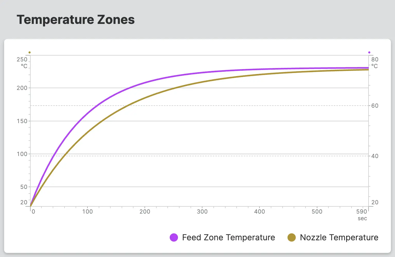
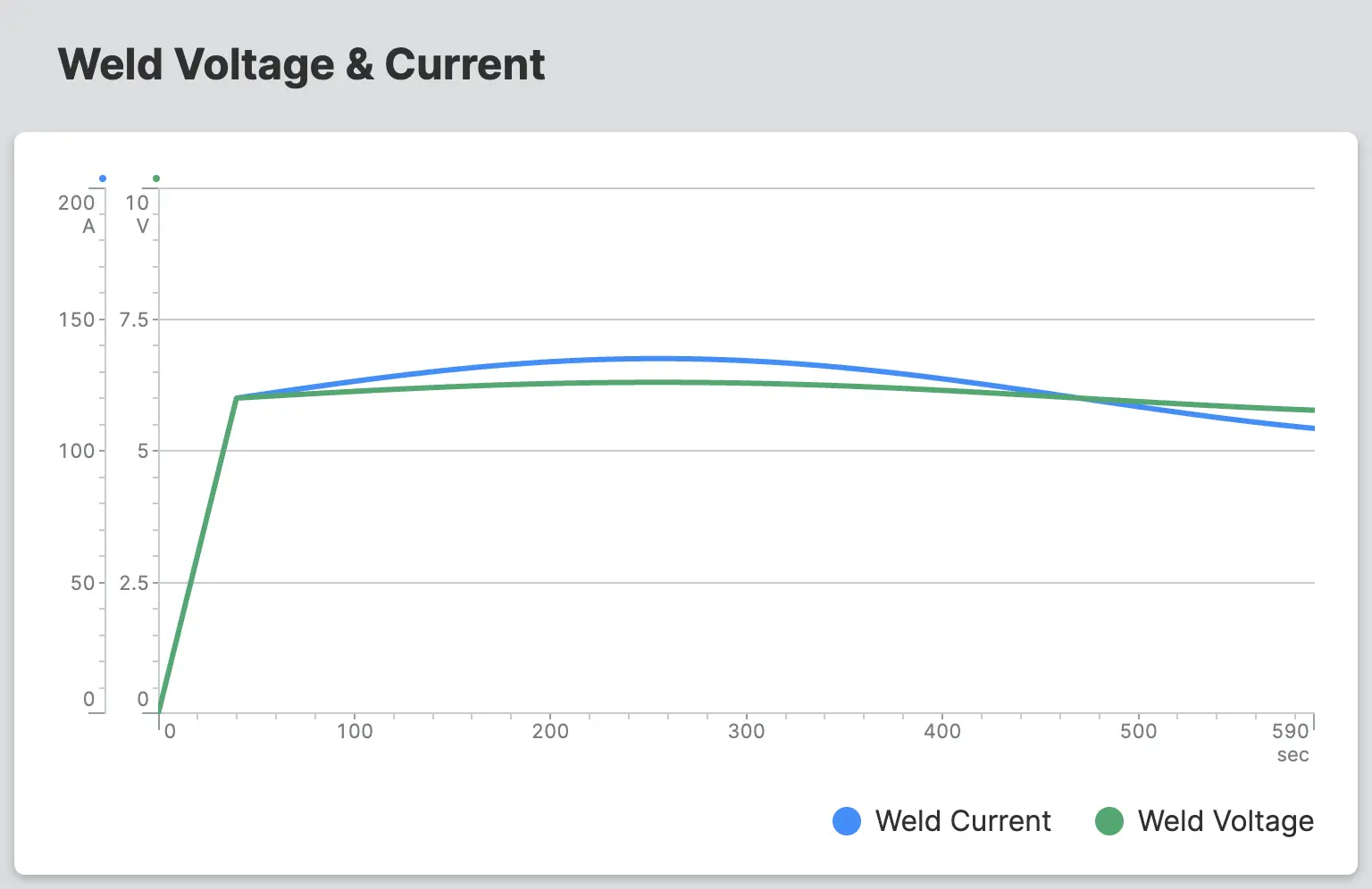
A 2D Plot visualizes the relationship between one or more data sets and a
shared X-axis. The Y-values of the individual data sets are plotted against
the X-values in a two-dimensional chart.
As data sources for each axis, you can use dynamic arrays from your PLC or static sequences and arrays.
Typical use cases include visualizing the relationship between two signals, for example:
- Light intensity as a result of an object's rotation
- Temperature zones during a heat-up cycle
- Weld voltage and current during a weld cycle
The X dataset and each Y dataset must contain the same number of entries. Mismatched array lengths may cause incorrect or missing data in the plot.
Data Sources
Each axis accepts one of the following as its data source:
- Data Variable (Dynamic Property) — a dynamic
Arrayvariable from the PLC, updated in real time - Array (Dynamic Property) — a static list of values defined manually
- Sequence — a static, evenly spaced range of values defined by min, max, and step
Properties
Y-Axis
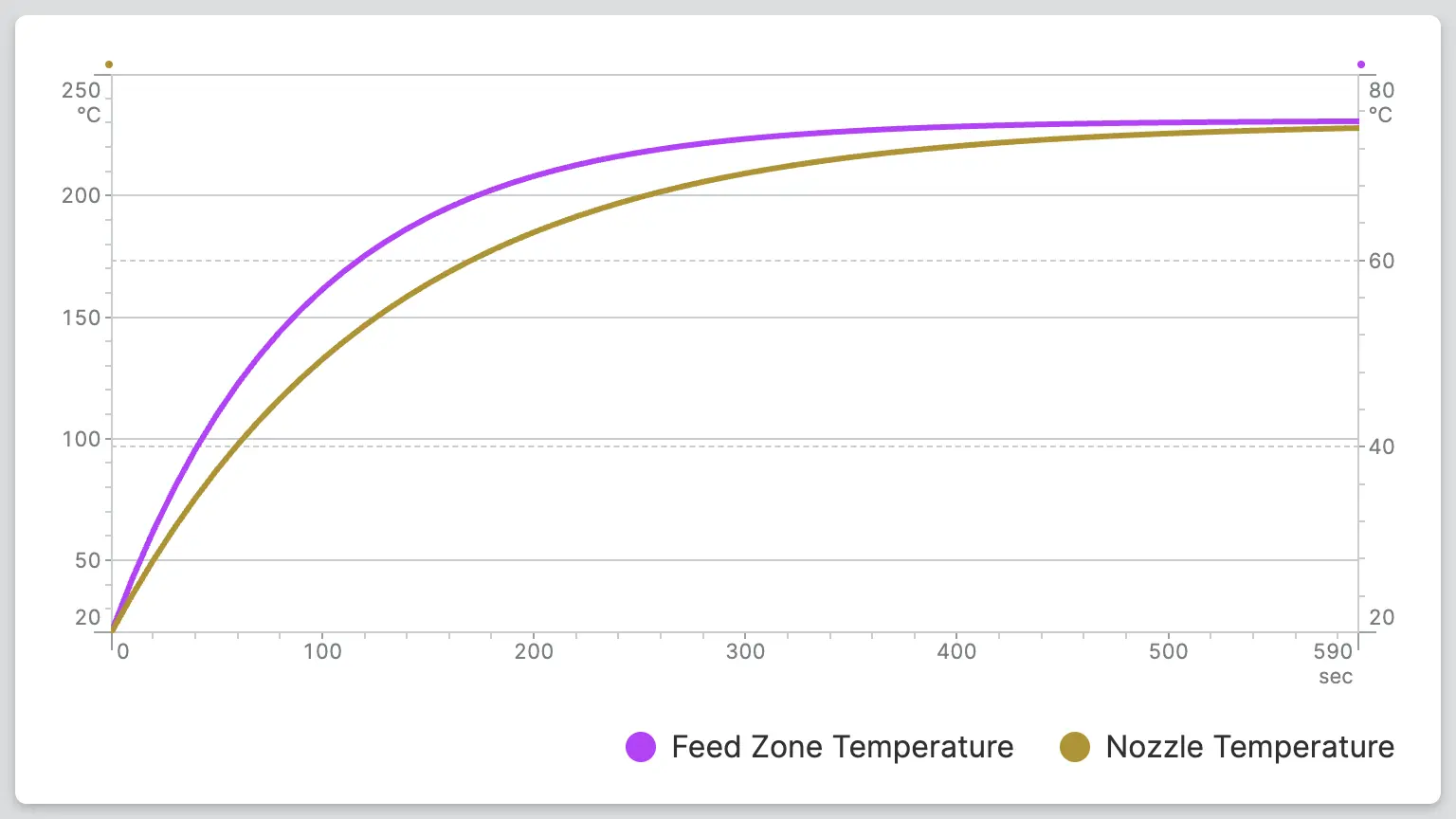
Define multiple datasets to plot against the Y-axis. Each dataset includes its own line settings (name, data, color, thickness) as well as axis display settings.
By default, HELIO groups datasets that share the same unit onto a single
shared axis, whose range spans the combined range of all grouped datasets.
Datasets with different units are displayed on separate axes automatically.
Enable Display Axis Separately to give any dataset its own dedicated axis
regardless of unit.
Name
Choose a name for the 2D Plot line. It will be displayed on the interactive ruler that will be rendered when touching or pointing at the plot.
Data
Defines the Y values of each data point.
Requirements When Using a Data Variable (Dynamic Property)
- Must use the
Arrayaccess mode to provide the full array, not a single item. -
Minimum and Maximum Values
The range of the Y-axis is determined by both the minimum and maximum of the linked variable. If these are not set, the 2D Plot will default to a Y-axis range of 0-100.
Line Color
Choose a color for the 2D Plot line.
Line Thickness
Choose the thickness of the data line.
Ticks
Control the number of ticks that the Y-Axis will display.
Auto
HELIO will calculate a fitting number of ticks for you.
Density
Select the number of ticks yourself by setting a density. Choose between low, medium and high.
Interval
Precisely select the number of ticks yourself by setting intervals. Choose how often a tick should appear and how often a label should appear.
Segments
Precisely select the number of ticks yourself by setting segments. Choose how many ticks should appear and how often a label should appear.
Show Horizontal Guidelines
Choose whether the horizontal guidelines of this axis should be visible or not.
Display Axis Separately
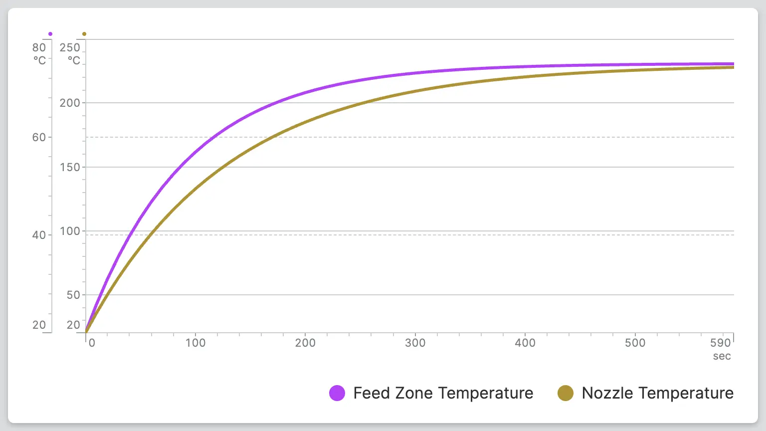
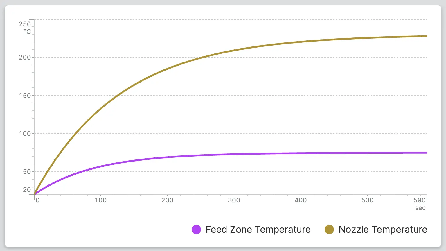
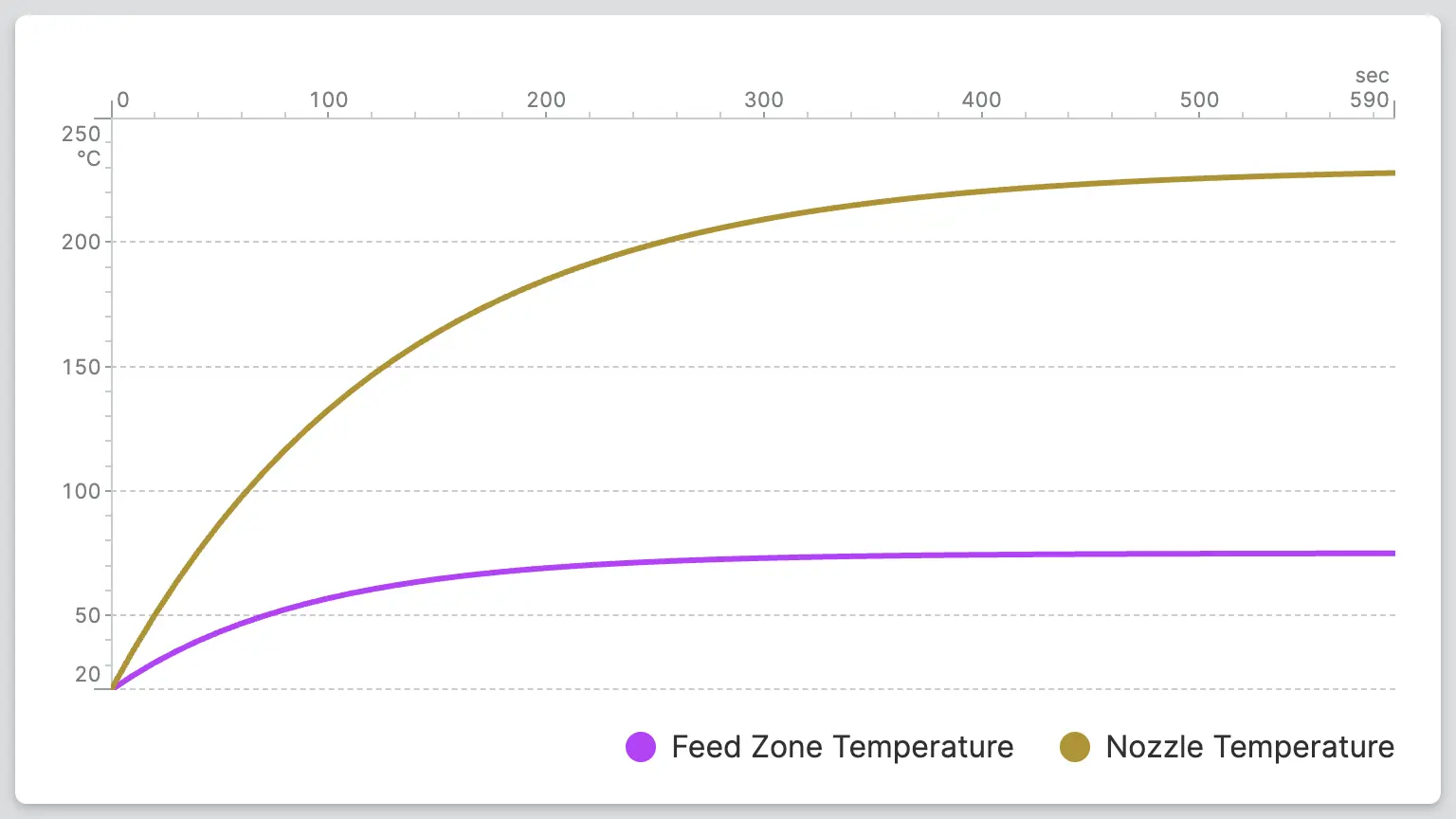
Display Axis From Top to Bottom
Choose whether the axis should run from bottom to top or from top to bottom.
X-Axis
Data
Defines the X position of each data point.
Requirements When Using a Data Variable (Dynamic Property)
- Must use the
Arrayaccess mode to provide the full array, not a single item. -
Minimum and Maximum Values
The range of the X-axis is determined by both the minimum and maximum of the linked variable. If these are not set, the 2D Plot will default to a X-axis range of 0-100.
Ticks
Control the number of ticks that the X-Axis will display.
Auto
HELIO will calculate a fitting number of ticks for you.
Density
Select the number of ticks yourself by setting a density. Choose between low, medium and high.
Interval
Precisely select the number of ticks yourself by setting intervals. Choose how often a tick should appear and how often a label should appear.
Segments
Precisely select the number of ticks yourself by setting segments. Choose how many ticks should appear and how often a label should appear.
Display Axis from Right to Left
Choose whether the axis should run from left to right or from right to left.
Container
This icon will be displayed next to the element's label on pages that support it, like the Dashboard Page. An Element can make use of the icon to:
- Provide more context to add meaning
- Improve recognition and discoverability, especially on larger pages
Action
Button that will be displayed in the upper right corner of the element. By pressing it, users can execute an action.
Action that gets executed when clicking the button. Use it to:
- Open overlays that provide additional context or detailed controls for this element using the Open Page as Overlay Action.
- Navigate to other pages using the Navigate to Page Action.
- Execute logic on your PLC using the Write Data Variable Action or Call Data Method Action
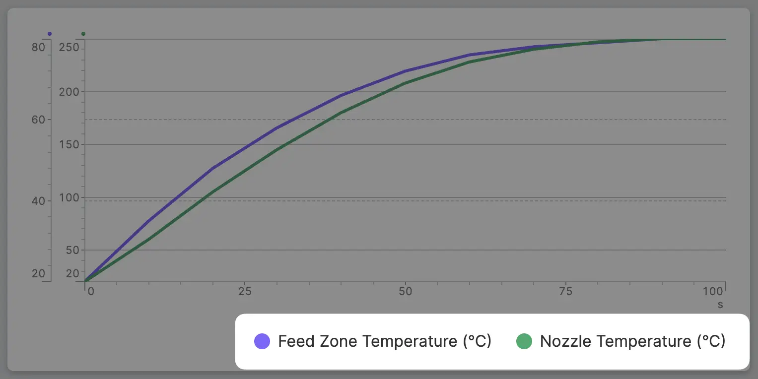
Enable Legend
Displays a legend below the plot listing the name of each Y-axis dataset. Operators can toggle individual lines on or off by clicking their entries in the legend.
Display Condition
true or false you're good to go.